NOAH
NOAH is a men's grooming and skincare brand that uses natural ingredients. Using a nautical/ sailor theme for the packaging, I really wanted to incorporate into the brand so that if people bought just one product, they would know that there is a family of other products in the brand. A sustainable brand, using recycled materials for packaging and donate a percentage of the profit to ocean non-profits.
The Process
The Logo
Finding the correct logo was a bit of challenge, but doing research I found various inspirations and sketched a few rough drafts for potential contenders.
Logo Dimensions
Research
These images are some of the research. Vintage sailors, Breton stripes, American traditional tattooing, and examples of men's grooming products. Since I wanted to use a sailor/ nautical theme I feel these examples are a perfect match.
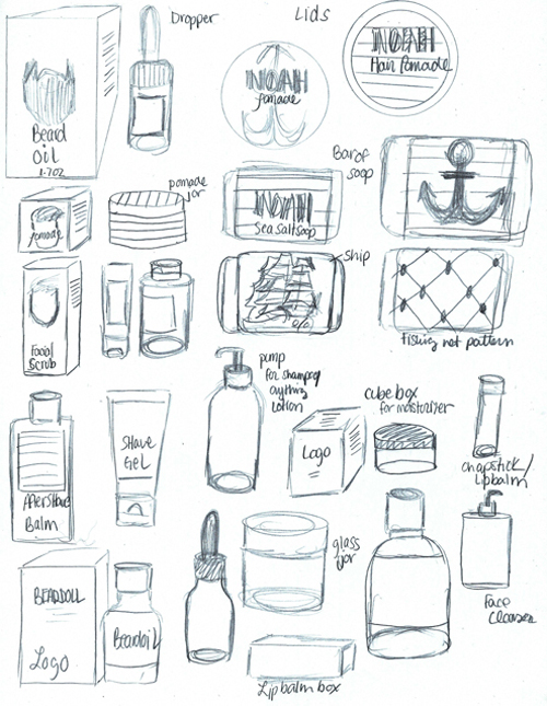
Packaging Sketches
These are some examples of what packaging will be used which include various packaging boxes, containers, and some early thoughts on what products to put in the NOAH family.
Die-lines


Final Iterations
These are the final iterations for the packaging. Since my inspirations for this brand came from sailor and nautical life, I used navy blue for the packaging color, as well the Breton stripes inspired from Breton stripe sailor shirts, and used various symbols of a sailor and traditional American tattoos.


